Brand Identity + Asset Development for an Industry-Aligned Framework
Client: mindful MATERIALS
Consulting Firm: Parallel
2025
The Common Materials Framework (CMF), developed by mindful MATERIALS, provides a unified language for evaluating the sustainability of building products. Designed for manufacturers, architects, designers, and data platforms, the CMF bridges disparate rating systems and tools to enable aligned, actionable material decisions. The brand identity had to reflect this complexity and credibility, all while staying accessible, functional, and scalable across countless tools, toolkits, and platforms.
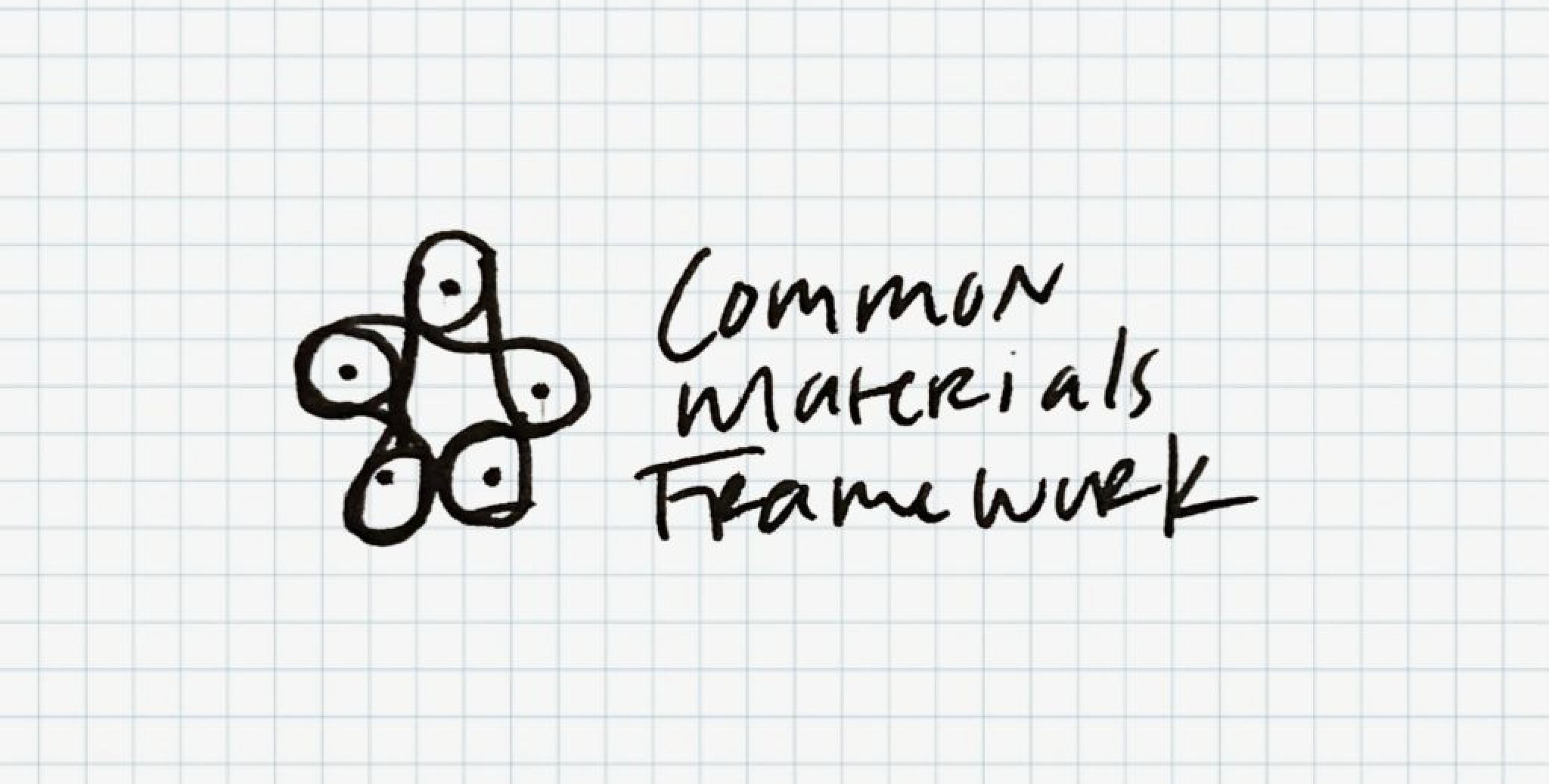
From Sketch to System
While supporting the development the Common Materials Framework, it became clear that the framework needed a visual identity that made it immediately recognizable.
The first sketch happened in a grid-lined notebook after a design conference keynote on iconic brand marks. The goal wasn't to illustrate every aspect of the framework, but to create a symbol that could represent the idea as a whole.
The original concept centered on five interconnected loops, each representing one of the framework's five impact areas, connected through a common center. That idea remained unchanged throughout the design process. The refinement wasn't about finding a different solution—it was about making the original idea clearer, simpler, and more scalable.
The final mark became more than a logo. It became a visual shorthand for a connected materials ecosystem.
The Design Principles
Brand Alignment: Reinforce the Common Materials Framework while fitting naturally within the broader mindful MATERIALS brand ecosystem, creating a distinct identity that still feels connected.
Simplicity: Distill a complex framework into a mark that is immediately recognizable and memorable.
Scalability: Maintain clarity from a 16px favicon to conference signage and presentation decks.
Versatility: Perform consistently across digital, print, monochrome, full color, and light or dark backgrounds.
Longevity: Create a timeless identity capable of evolving alongside the framework.
The Common Materials Framework mark wasn't designed to illustrate sustainability. It was designed to give an ambitious framework a recognizable identity—one that makes something inherently complex feel organized, connected, and approachable.
Logo Design
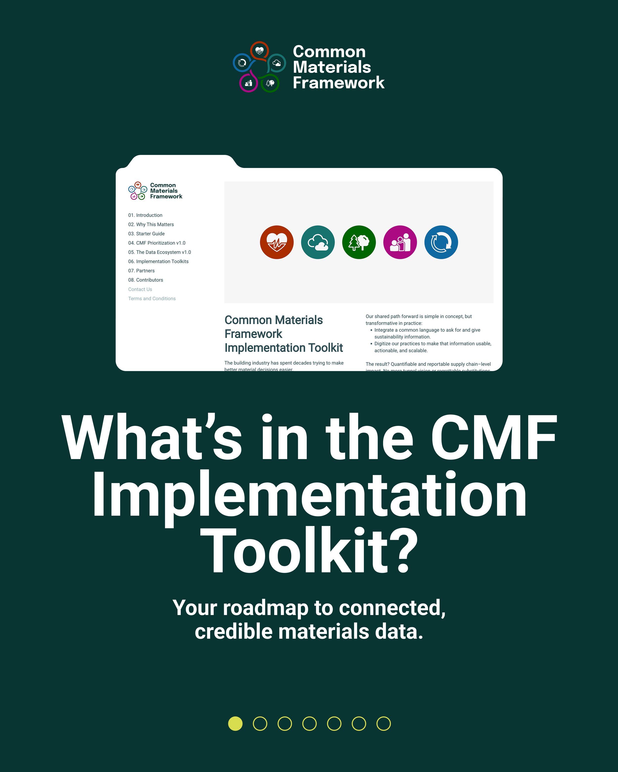
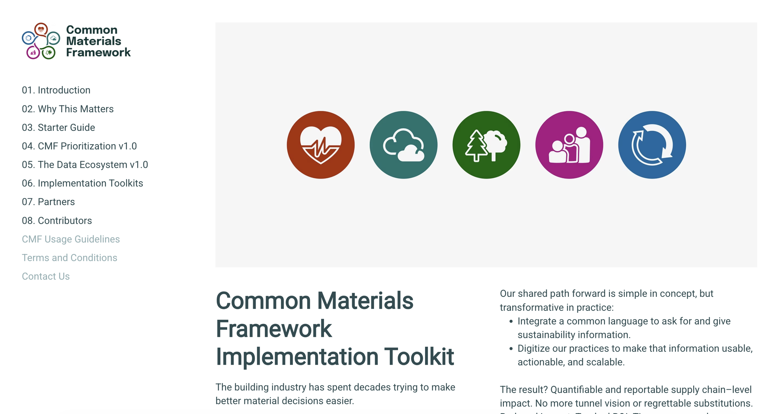
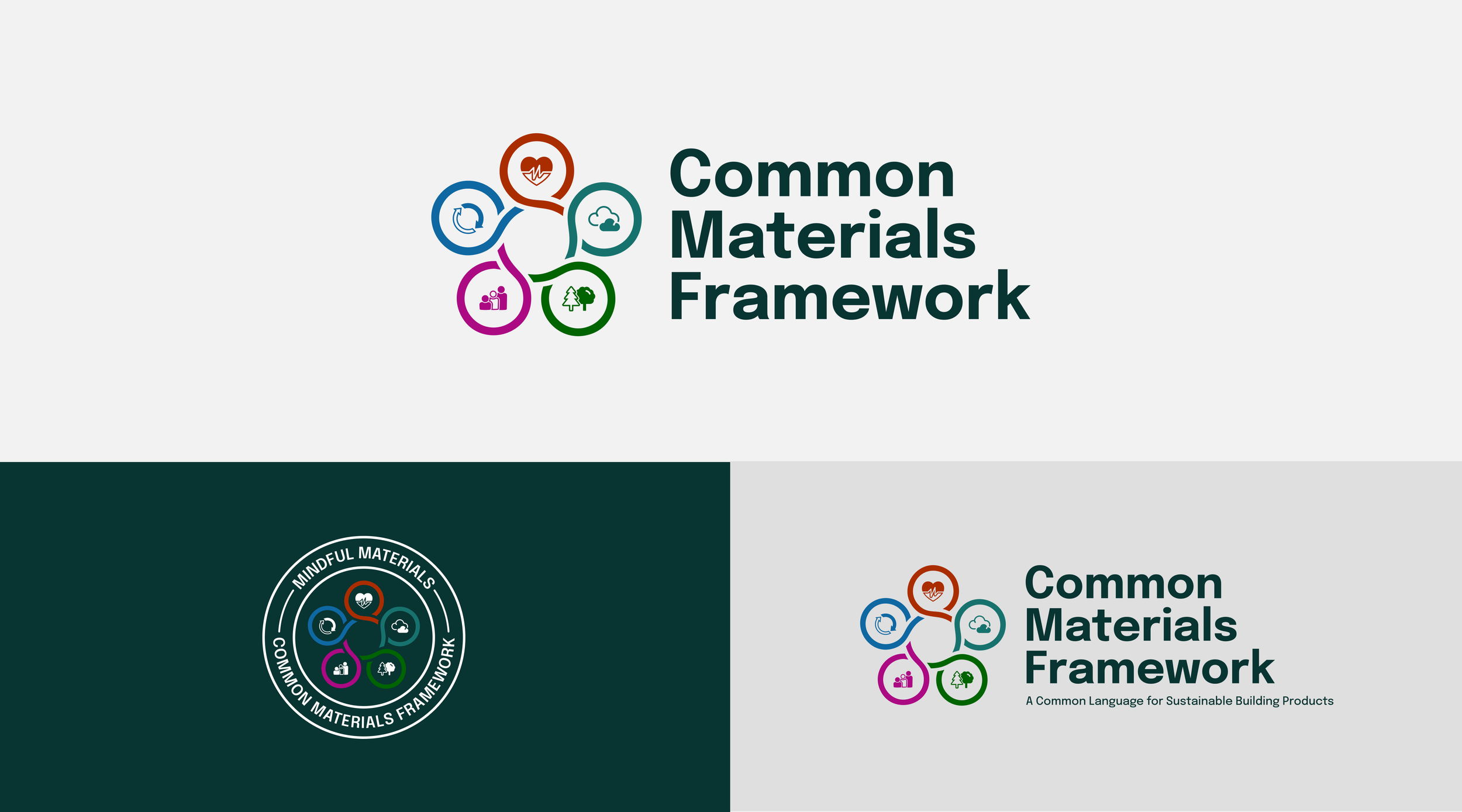
The primary logo pairs a clean, bold wordmark with five color-coded icons in a continuous loop—each representing one of the CMF’s core impact areas. The icons are pinned in a circular system, suggesting both structure and collaboration—core to the CMF’s mission.
Color Palette
A system of deep greens and charcoal provides a foundation of trust and neutrality, while each impact area’s icon is given its own distinct, high-contrast accent color. This supports easy visual categorization and aids in navigation across complex toolkits and diagrams.
Typography
A modern sans-serif typeface was selected to ensure maximum legibility across applications—especially data-heavy environments. The font supports clarity in technical materials while maintaining a clean, contemporary aesthetic.
Visual Language
Simple, flexible design elements were developed for use across platforms—supporting a wide range of digital content without overwhelming it.
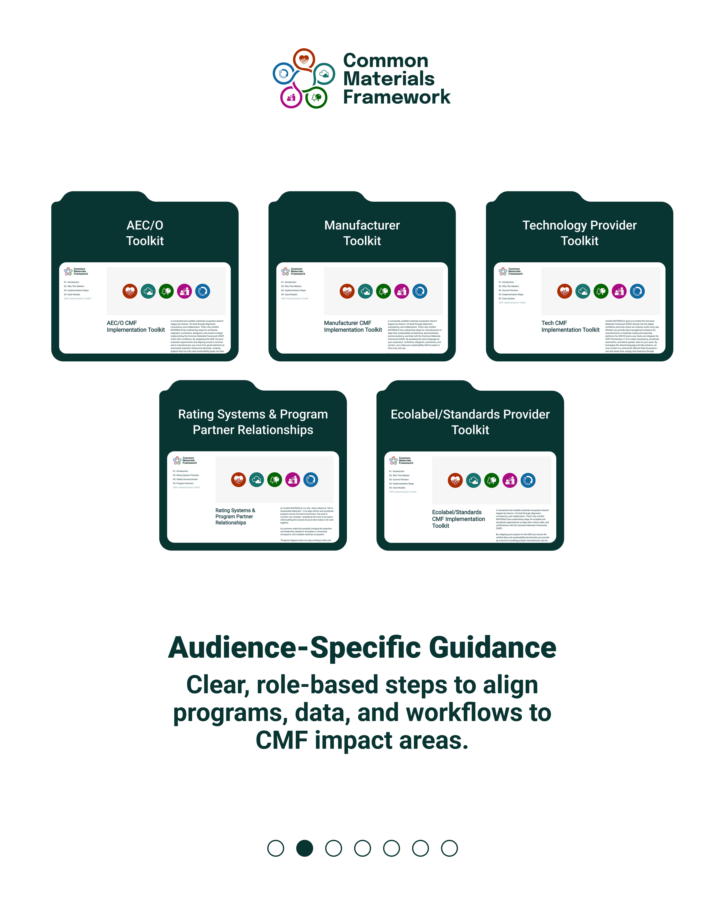
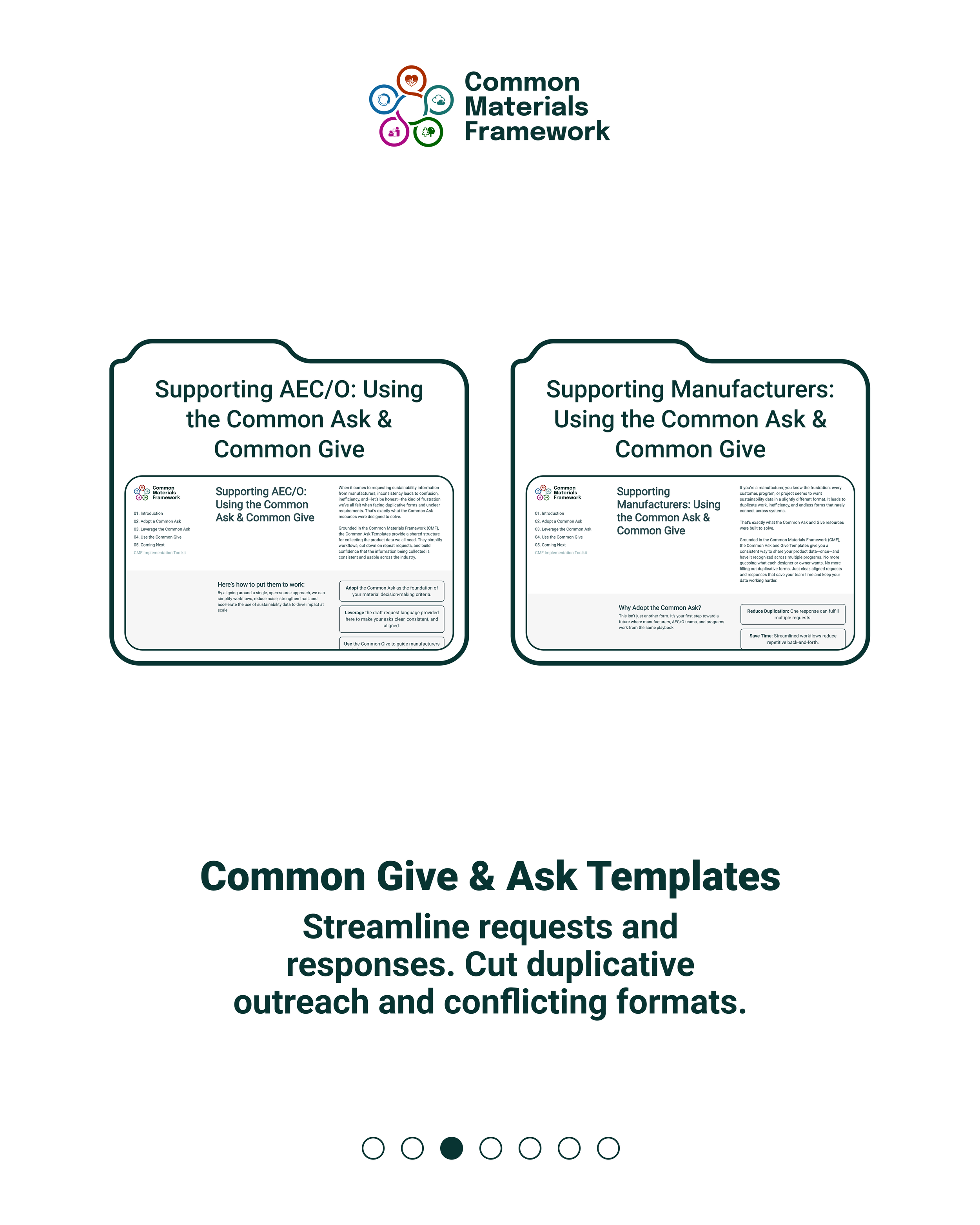
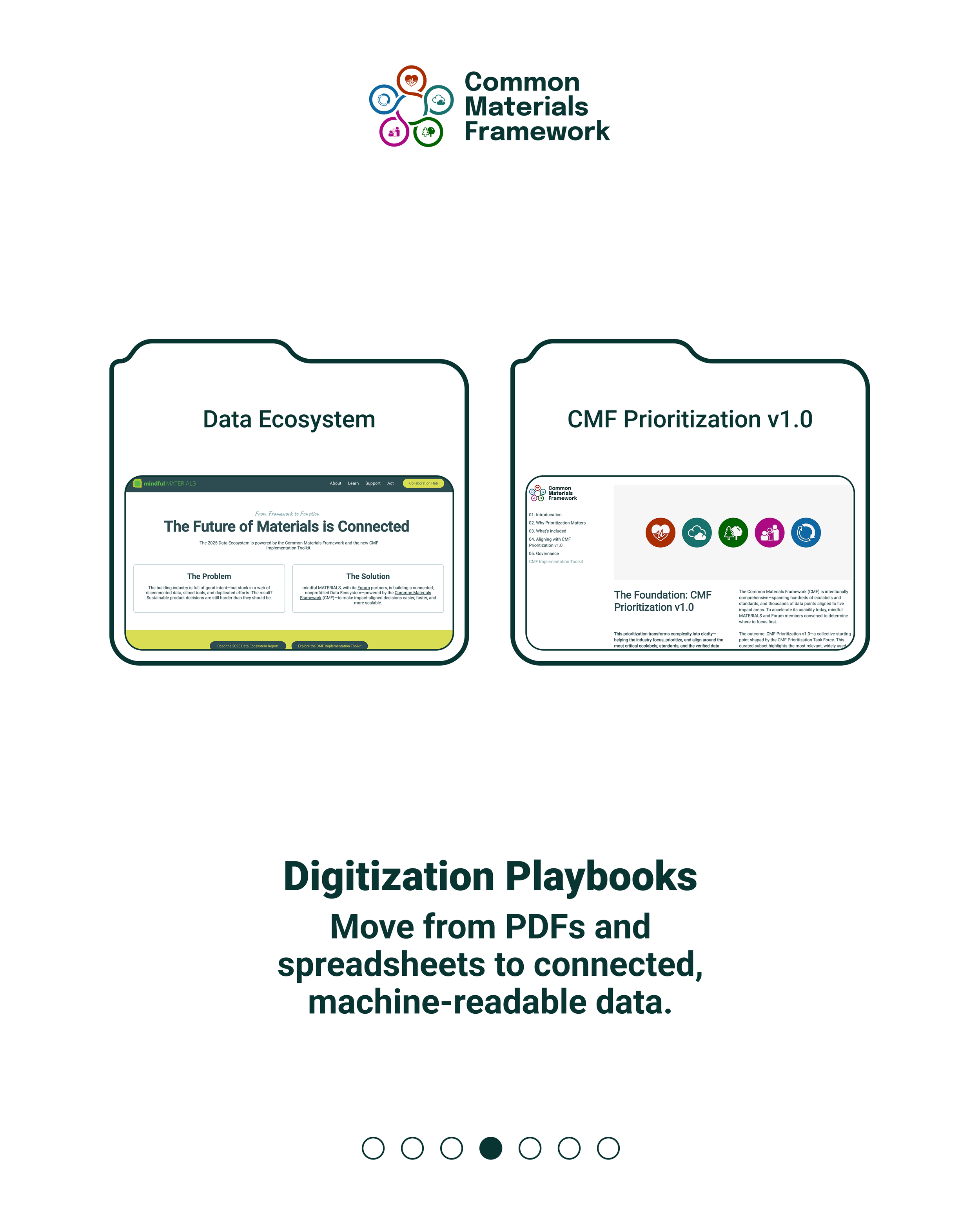
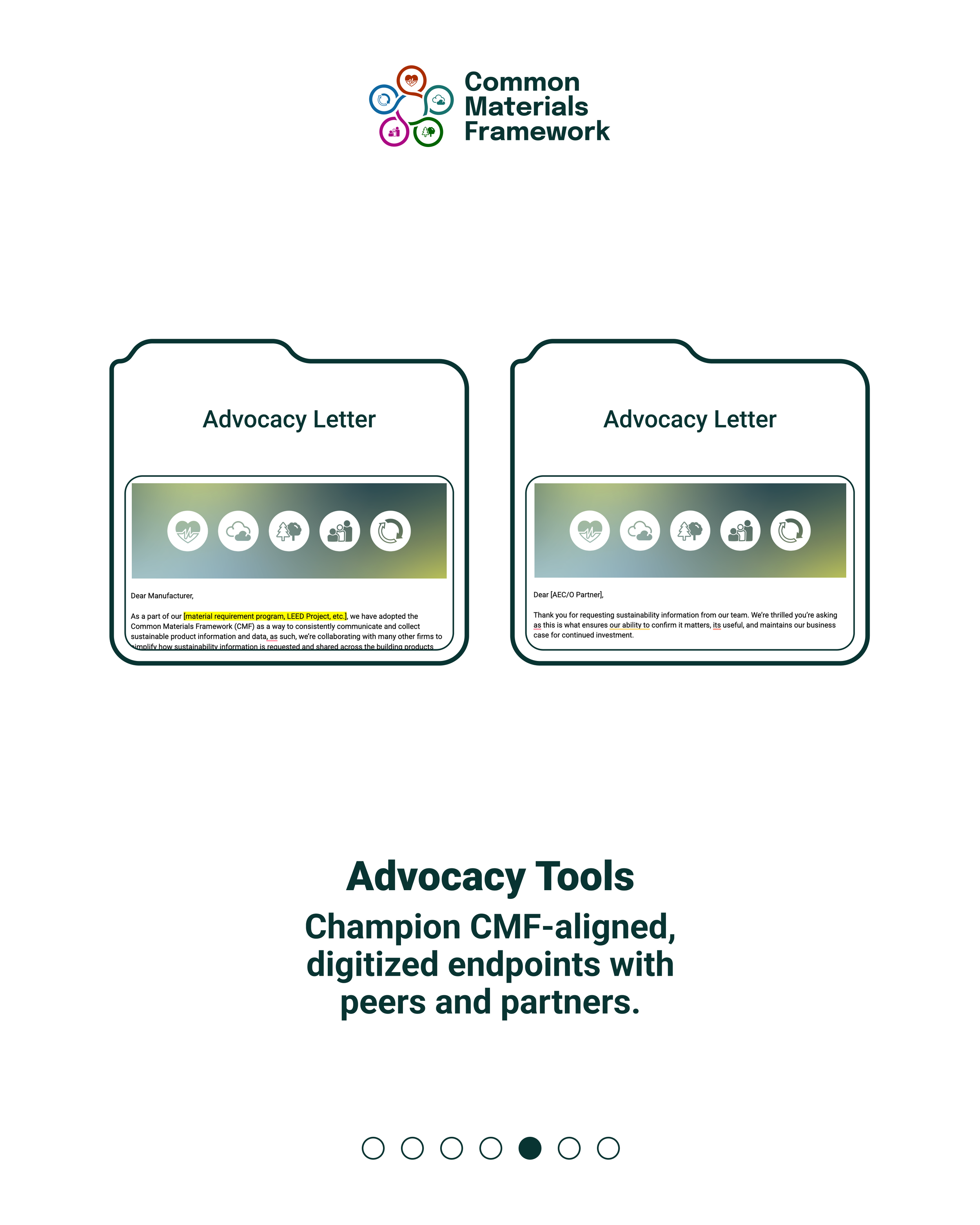
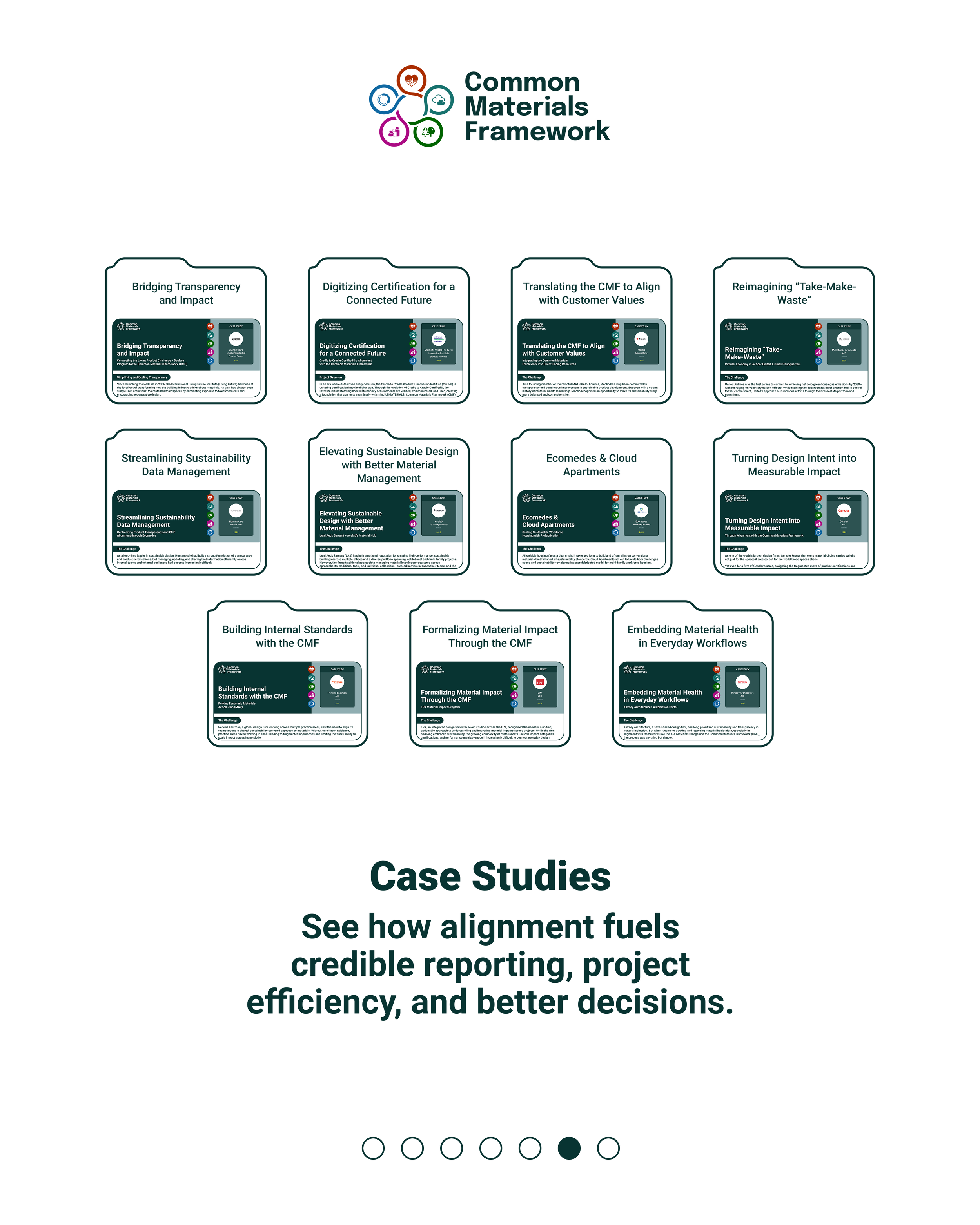
The new CMF identity system serves as a clear and consistent anchor across all mindful MATERIALS communications. It provides the infrastructure for deep adoption—allowing stakeholders across the value chain to confidently reference, align with, and integrate CMF into their workflows. The framework is now being implemented across toolkits, APIs, digital platforms, and national and global design events—always grounded in a visual identity that reflects its rigor, clarity, and collaborative mission.